Mobile Design
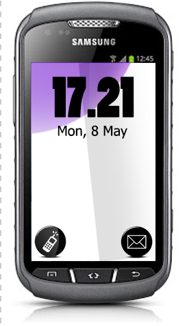
I was trying out different designs for my homepage. I didn’t know whether to choose putting a search bar at the top or the time. I decided on the time because that is what I use my phone for most when I glance at it on the go. If I want to search something I am sitting down somewhere and I am ready to switch pages and search so I don’t feel that I need search on the homepage.

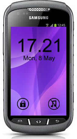
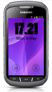
On the lock page the only things I need is the time, date, lock and silencer.
The first design I like the fact you cannot see the lock and silencer until you put your finger on the screen and they dynamically appear. I do not like the typography in the first two though. I decided on the third phone as I like the typography and the two controls are faint but visible so I think it makes the design more intuitive for the user.

These are designs I designed for the music pages. The first one is a nice way to flick through the albums by name but it needs an alphabet search on the side like the second one. The second one is still very visual but I think a user needs the clear white background for the alphabet search. It is clearer to see and to navigate. The third one is the album, on the left a graphic of the CD the front and black of the album cover and a list of the songs. When you click on a song a small rectangular box with controls will appear on top of the page for stop, pause etc. to get back to the album click on the background to get back to albums swipe to the side, I may need to put an arrow to make it more intuitive.


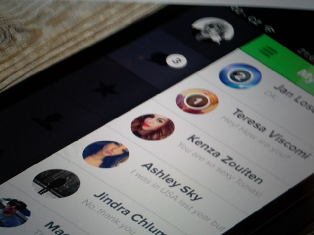
I, like most people contact all the same people so I made a favourites page with all the people I contact regularly. So by clicking on the name my phone would ring the person on speed dial. Handy for someone with a busy life. I like the different colours as it makes the screen more user friendly and the more that screen is used and the user associates the colours with the number that is saved I think it will be more intuitive to use and I would use this without thinking.
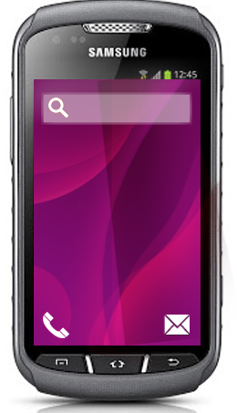
The Google page is because I use google search all the time and I like the aesthetics and usability of google search. It is a search tool that most people are familiar with and that is why I designed one of the interfaces of my phone with Google, also because I like to use it.


Mobile is where it’s at http://blog.visual.ly/the-future-of-animation-design-is-optimized-for-mobile/
“As of 2013, 58% of all US consumers already own a smartphone. More than 1.2 billion people access the Web from their mobile devices. Global mobile traffic now accounts for 15% of all Internet traffic. No one screen size has more than 20% of the market share – and designers have to find ways to communicate information across all these different screen sizes. It’s not just a one way street, either; touch-based UIs require designers to envision and guide users’ interactions with that information.“
I found interesting design tutorials here
What to think about when designing mobile UI
- Use less text.
- Don’t frontload.
- Make it fun.
- Reinforce learning through play.
- Listen to your players.
I used this as the cover for the file for behance
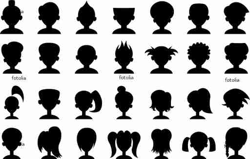
I was going to use these silhouettes to make buttons for quick dial to different people.
Good website that did studies on mobile design
Insight from the research, this is for retail but something to think about in the future as a designer
1) Sight usability
2) Product zooming
3) Adding to basket
4) Omnichannel strategy VS real life contact us experience
5)Finding returns information

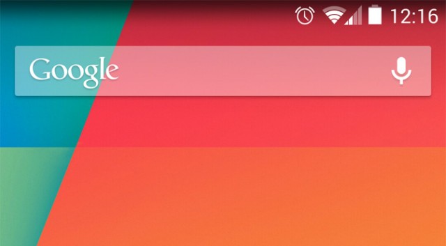 Like the google search bar
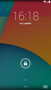 Love these colours
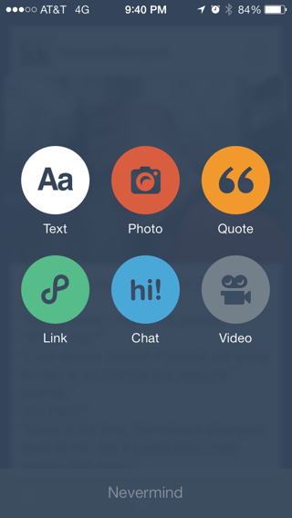 Simple colourful design is nice here
 I really like this flat design and the colour.
Reading through the handbook in Mobile Design average sizes are 240×320
Points for developing mobile sites that I thought were important were
1) Option to visit original site
2) Use a separate mobile theme
3) Scroll in one direction only
4) Minimize Images
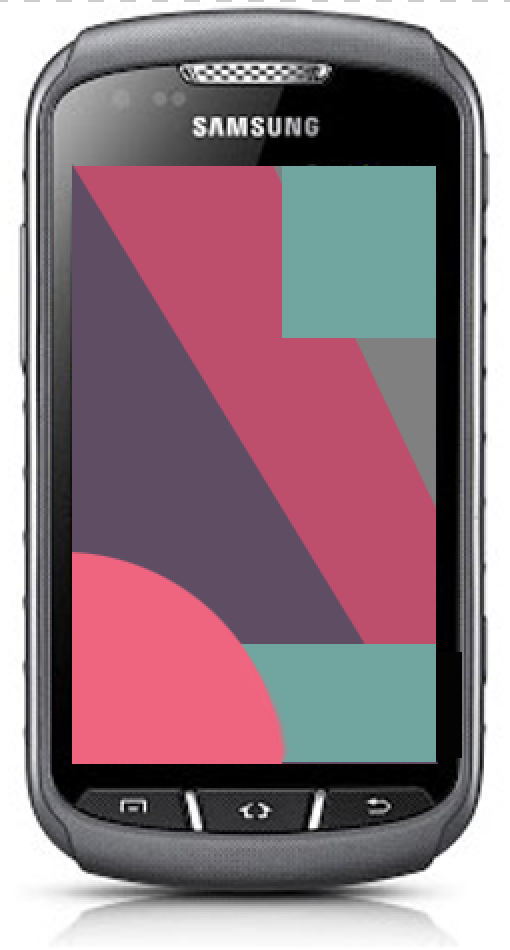
I love the contrast in colours in this between the black and illuminous.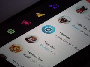
I like this because it is very visual for an album instead of a list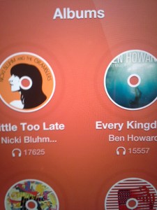

Listing friends in a new and inventive way
Personaly I think people react better to more visual and aesthetically pleasing screens

Again the black screen I like and circles and colours.


No comments:
Post a Comment